Continuing my pursuit of additional practice and learning, here’s my second challenge, this one from Global Design Project, it’s the Global Design Project 174 | Sketch Challenge. The challenge here was going from vision to final product. This is one where the final product did not match the vision. While it still adheres to the sketch challenge layout, my original thinking had to take a detour early on when the painting didn’t come out as I planned. Live and learn, right? (I need to remember to take photos along the way) When it didn’t come out right, I had to figure out something else. I have a hard time just dropping a card when I make these ‘mistakes’ and really, right now, I’m still experimenting and trying new things anyway. I figure if I really ruined it, then I could move on. Well, actually I had moved on and started a new card but Ira happened to see it and very kindly gave me the encouragement to go with it. So.. I’m kinda on the fence about this card.. but I think that’s more because it’s not matching my original vision and I’m having difficulty setting that aside to look at it with fresh eyes.
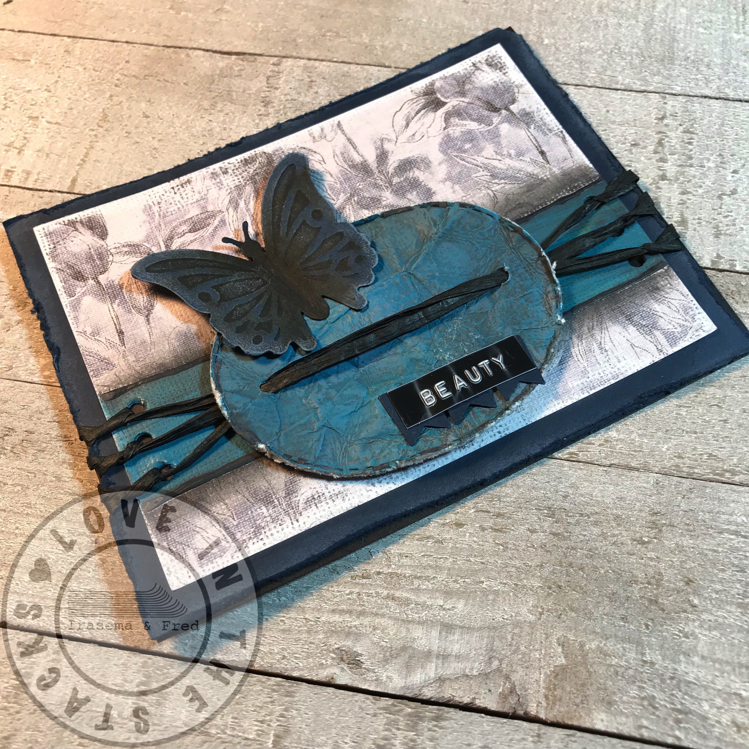

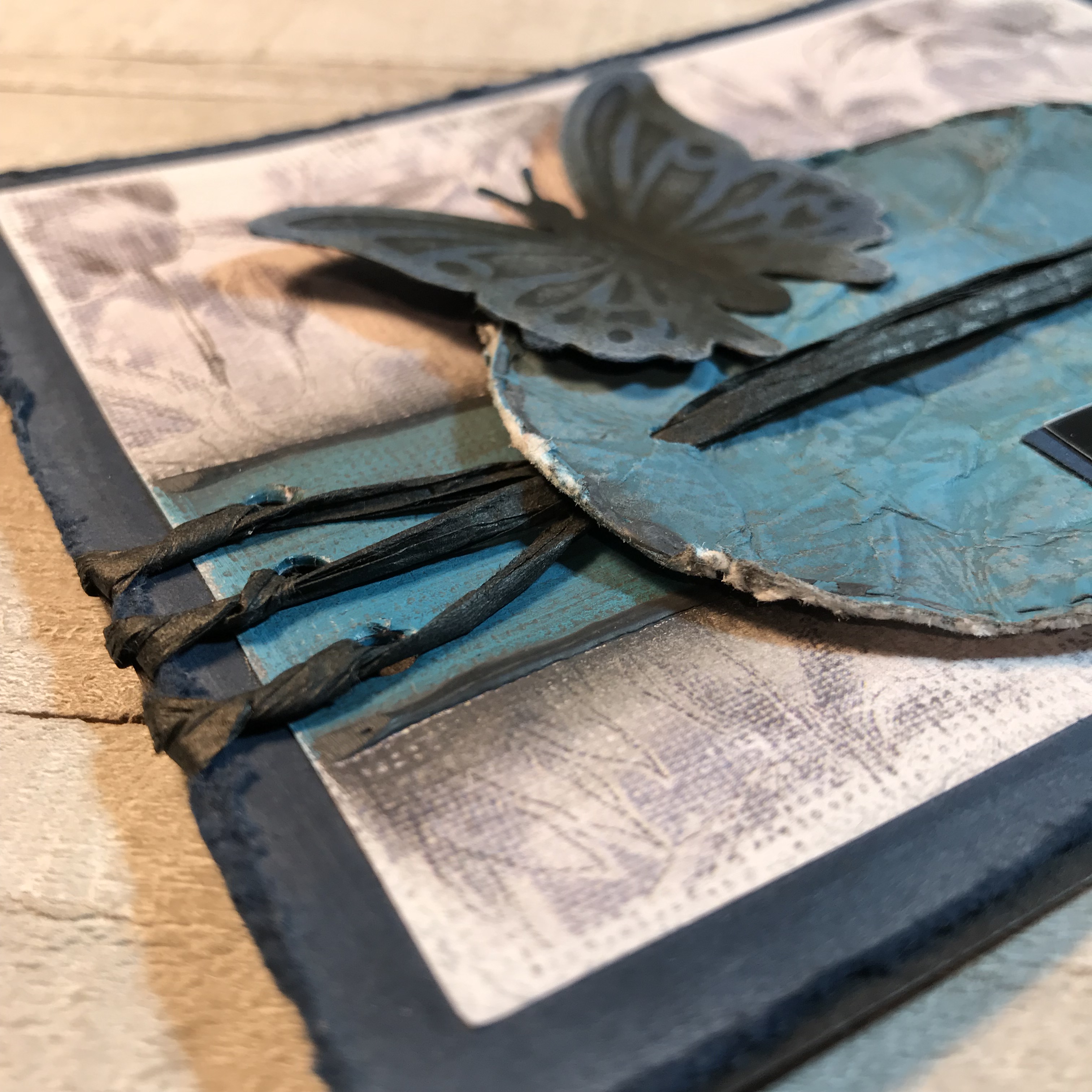
The layout is pretty much as planned. I started with the idea of painting that stripe across the card but I wanted to make it multicolored. I used Distress Paint: cracked pistachio, mermaid lagoon, and spun sugar. I had hoped to create more of a swirl effect but, not really experienced in this, I pretty much just ended up making a new color (ha-ha)… It was definitely more turquoise than I wanted or preferred. I simultaneously tried smushing the oval into the paint and, I guess over-smushing it, resulted in the same solid new color… I then thought, well, what can I do? That resulted in using some black Art-C Ultra Chalk to outline both the stripe and the oval. Still not working for me… so some distressing is in order. The butterfly was already embossed and cut. While distressing the card and the paint (I crumpled the oval, obviously) I spritzed the butterfly with Vintage Photo Distress Spray Stain. The white accents were made with picket fence Distress Ink, to kind of correlate to the white in the background paper.
I forgot to mention that the Gina K Designs blue cardstock base was kind of where it started, as I’ve been primarily working with black paper or kraft paper and wanted to try some blue. I then found that background paper from the Paper Studio “Chambray Fabulous” collection to match the blue. That was what lead to the paint color choices.
So once the distressing was done, the string was next and I went with black raffia. How to add the raffia went through a few iterations until I finally want to get it lined up and somewhat symmetrical. I wanted to originally use larger banners with individual letters but ended up with the label and small banners, made from the same blue cardstock.


Would love your feedback, especially from those more experienced. Tips, tricks, suggestions? All appreciated and beneficial to improving. Thanks to the Global Design Project for the challenge!
http://www.global-design-project.com/2019/01/global-design-project-174-sketch.html
