My third card challenge (first challenge that’s not a sketch challenge) comes from Casology, http://casology.blogspot.com/, Week 329: TURN This one’s about keeping it clean and simple; the rules being:
1. One main image 2. Lots of open space, uncluttered 3. Limited layers & embellishments 4. Quick & easy to recreate (Note: It may take a while to create a design you like, but once you have that design, making more should be a piece of cake!)
I already had the Lawn Fawn “hello” cut out, so I went from there. The challenge was in what to add or how to accentuate the hello, as by itself was just way too stark. Clean and simple, yes, but it just seemed too little. Almost like cheating? I don’t recall all my thought processes in this but at some point, I think while looking for a color combo to go with the blue hello, I happened upon the light blue piece of scrap I had. I went with the band in the middle under hello and I think it was just right… what do you think?
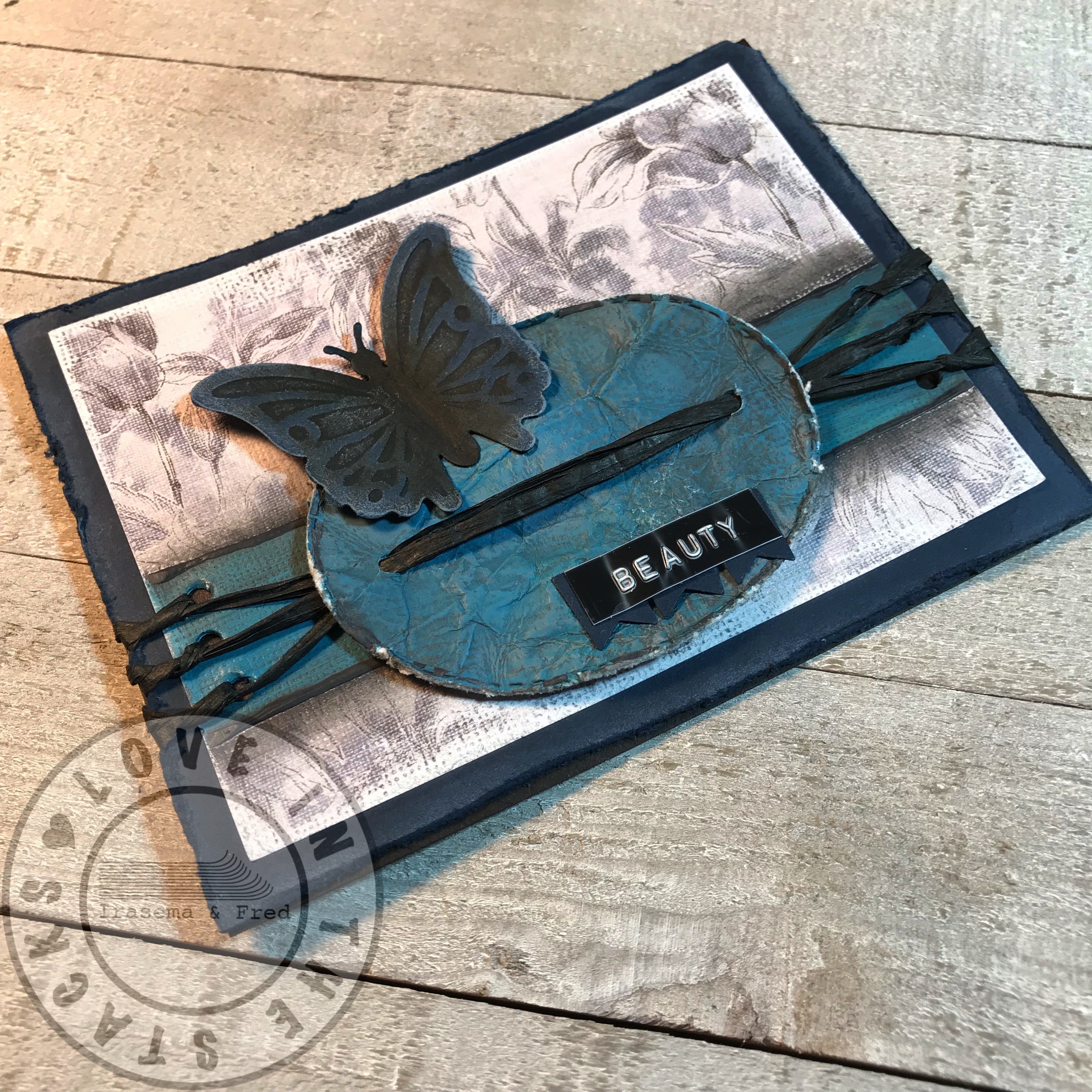
Continuing my pursuit of additional practice and learning, here’s my second challenge, this one from Global Design Project, it’s the Global Design Project 174 | Sketch Challenge. The challenge here was going from vision to final product. This is one where the final product didnot match the vision. While it still adheres to the sketch challenge layout, my original thinking had to take a detour early on when the painting didn’t come out as I planned. Live and learn, right? (I need to remember to take photos along the way) When it didn’t come out right, I had to figure out something else. I have a hard time just dropping a card when I make these ‘mistakes’ and really, right now, I’m still experimenting and trying new things anyway. I figure if I really ruined it, then I could move on. Well, actually I had moved on and started a new card but Ira happened to see it and very kindly gave me the encouragement to go with it. So.. I’m kinda on the fence about this card.. but I think that’s more because it’s not matching my original vision and I’m having difficulty setting that aside to look at it with fresh eyes.
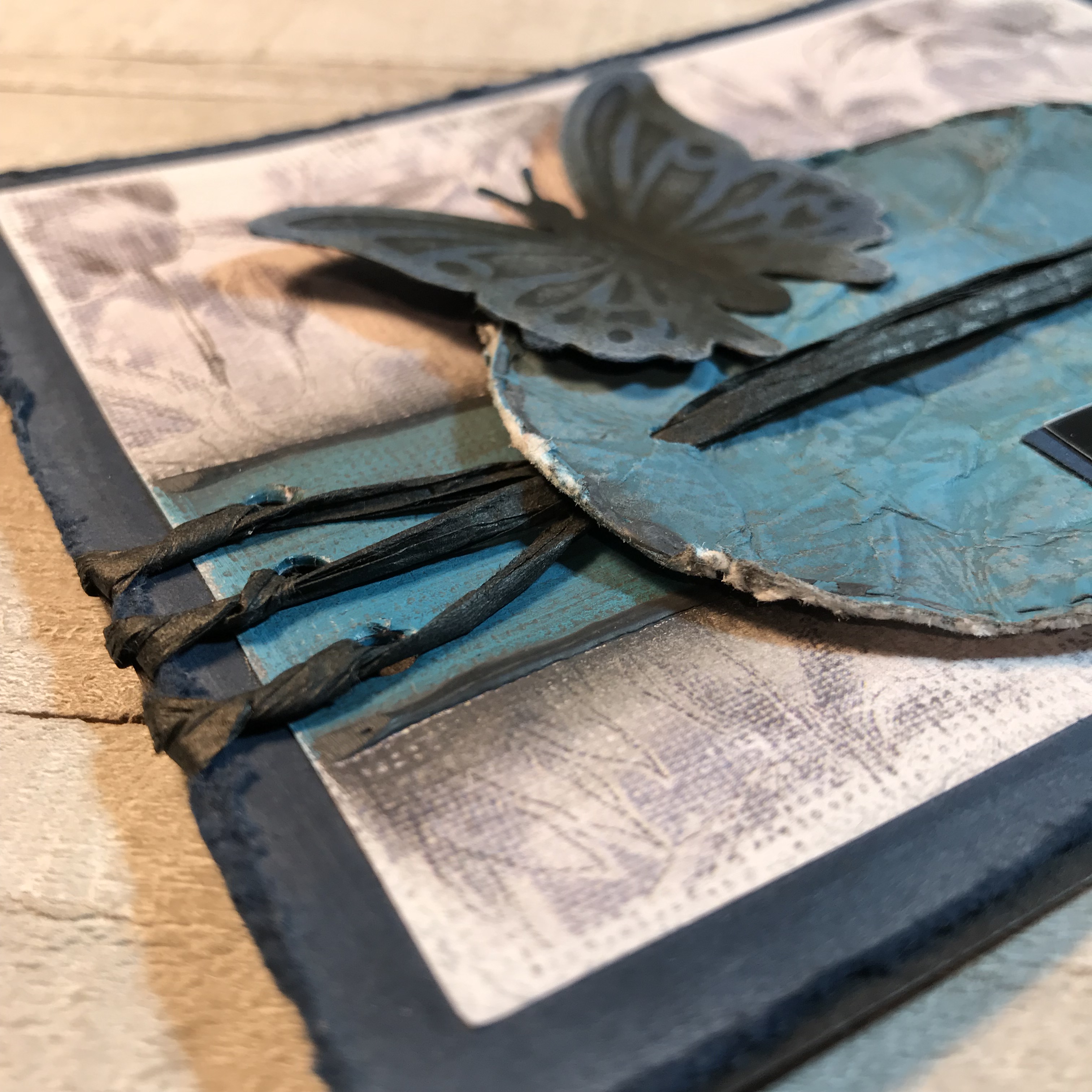
The layout is pretty much as planned. I started with the idea of painting that stripe across the card but I wanted to make it multicolored. I used Distress Paint: cracked pistachio, mermaid lagoon, and spun sugar. I had hoped to create more of a swirl effect but, not really experienced in this, I pretty much just ended up making a new color (ha-ha)… It was definitely more turquoise than I wanted or preferred. I simultaneously tried smushing the oval into the paint and, I guess over-smushing it, resulted in the same solid new color… I then thought, well, what can I do? That resulted in using some black Art-C Ultra Chalk to outline both the stripe and the oval. Still not working for me… so some distressing is in order. The butterfly was already embossed and cut. While distressing the card and the paint (I crumpled the oval, obviously) I spritzed the butterfly with Vintage Photo Distress Spray Stain. The white accents were made with picket fence Distress Ink, to kind of correlate to the white in the background paper.
I forgot to mention that the Gina K Designs blue cardstock base was kind of where it started, as I’ve been primarily working with black paper or kraft paper and wanted to try some blue. I then found that background paper from the Paper Studio “Chambray Fabulous” collection to match the blue. That was what lead to the paint color choices.
So once the distressing was done, the string was next and I went with black raffia. How to add the raffia went through a few iterations until I finally want to get it lined up and somewhat symmetrical. I wanted to originally use larger banners with individual letters but ended up with the label and small banners, made from the same blue cardstock.
Would love your feedback, especially from those more experienced. Tips, tricks, suggestions? All appreciated and beneficial to improving. Thanks to the Global Design Project for the challenge!
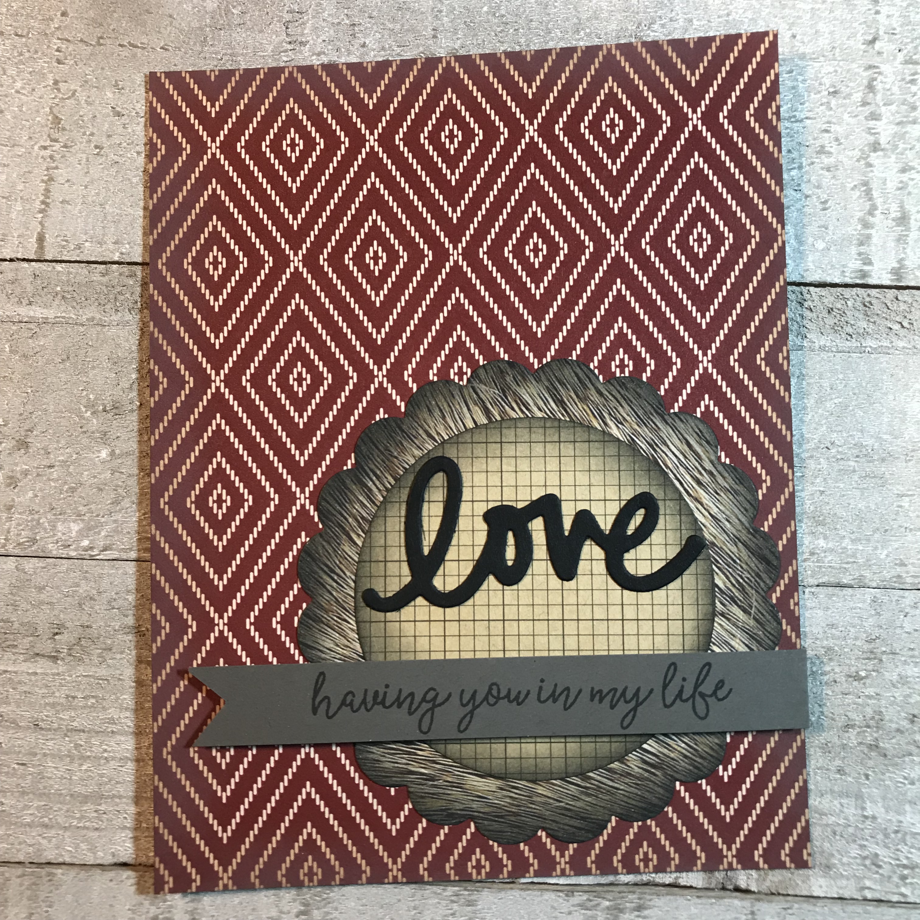
To get some more practice and try some new things, I thought I’d start participating in some challenges. I’m starting with the Paper Players PP426. This one’s a sketch challenge, so it’s pretty straightforward. I’m still learning my style and what works well for me. While I’m enjoying exploring ‘mixed media’, I still also like a very clean and simple design. However, I like to think of ways to be unique about what I’m creating, so with the basic layout of this sketch challenge I’m looking to add a twist.
This one started with thinking about the circle and the banner. I didn’t know what I wanted it to say or what colors to start with. As I looked through our supply of dies I found some circles, the medallion, the word Love and then a stamp set with a phrase I thought would fit well with ‘love’. It was beginning to take shape in my mind.
I tend to find myself going to the paper remnants and supply I have immediately at hand, rather than looking through pads. I have this sense of not wanting to waste what we have, while at the same time not wanting to use paper that hasn’t been used yet. In part, I guess, because I feel like I’m still experimenting. At any rate, I found the red & beige diamond pattern paper I wanted to use as the base. I played around with some color combinations, then the bear fur looked like it matched and would serve as the background medallion, and then the grid paper looked like it matched, as well, and would be the inner circle. I had a red paper in mind for the banner but it was a different red than the background paper red, so I didn’t like that. I stuck with just the gray by itself; gray seems to go with a lot of paper.
I cut out ‘love’ and stamped the sentiment phrase. Once the medallion and circle were cut and I laid it all out, Ira mentioned the bear fur medallion seemed to get lost in the diamond pattern. She was right… so I thought I’d try using some distress ink to give it some shading, and while I’m at it, shade the circle and the card. That made a big difference. I then thought to raise the banner. Add some glue and some foam dots, and there you have it!